CASE STUDY
Nutrition X
About this project
Overview:
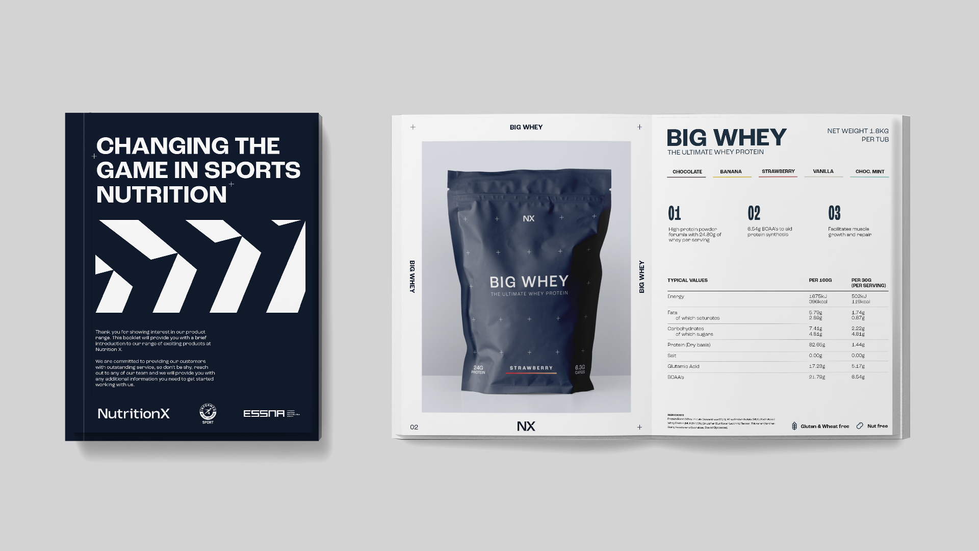
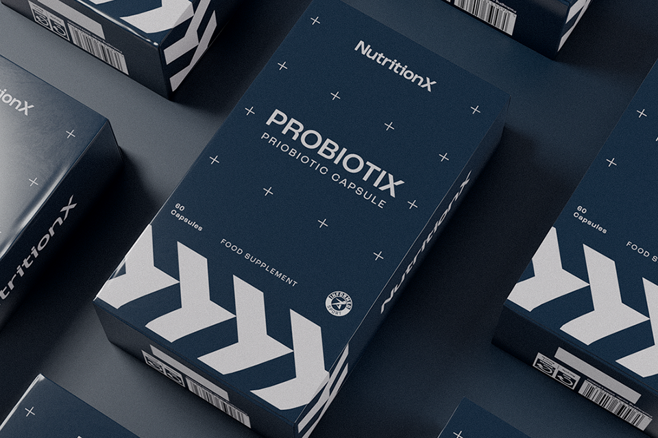
Nutrition X is an award-winning sports nutrition company that sought to refresh its branding across all channels, better aligning with its new position in the market. This rebranding initiative involved the development of comprehensive brand guidelines encompassing typography, photography, video and animation, alongside a complete redesign of the Nutrition X packaging for its entire product range.
Strategy:
The main goal was to reposition the brand to better target professionals, especially club nutritionists, while also appealing directly to athletes. I wanted a strategy that balanced science-driven credibility with athlete relatability, ensuring both groups could see their values reflected in the brand.
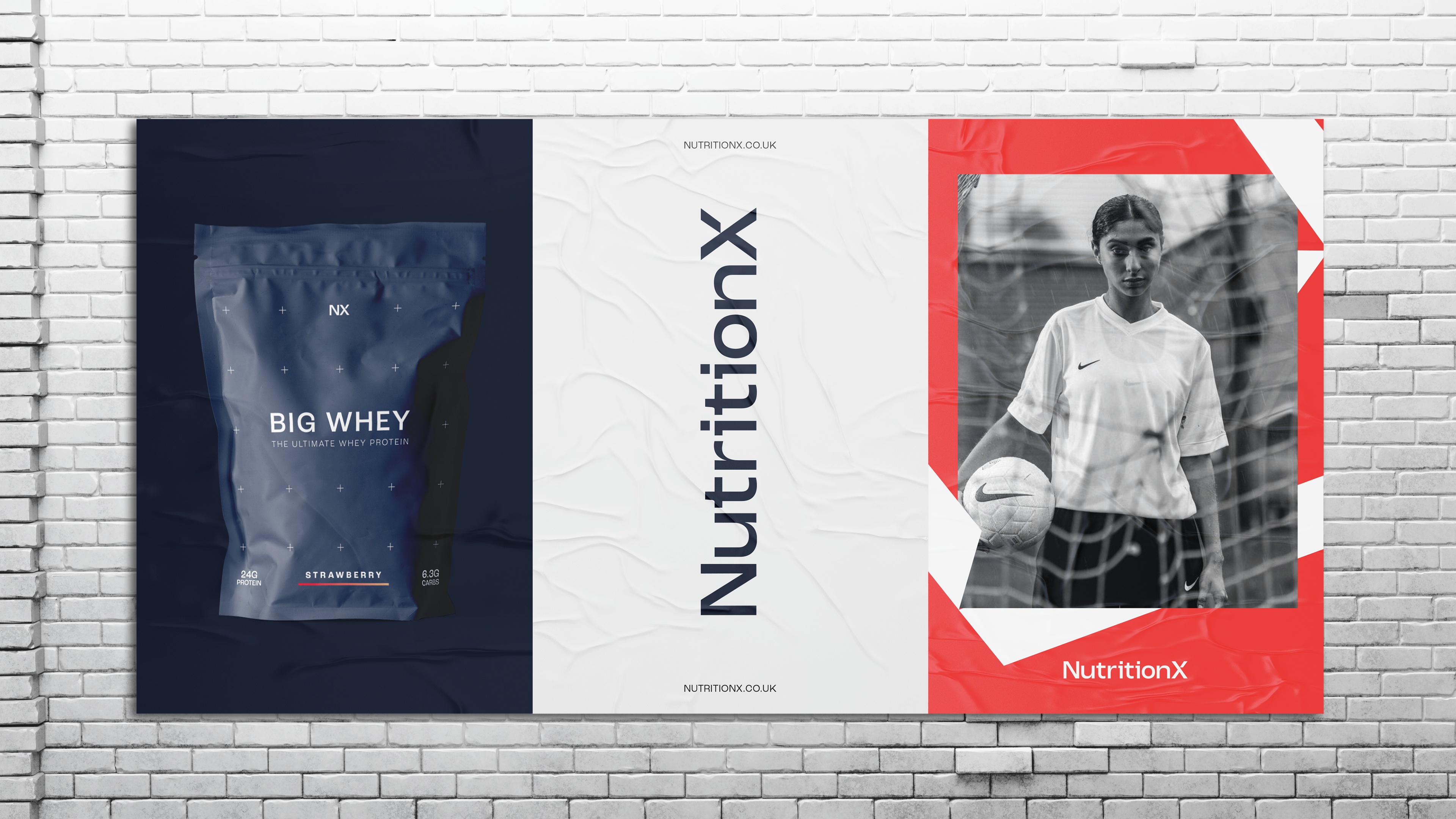
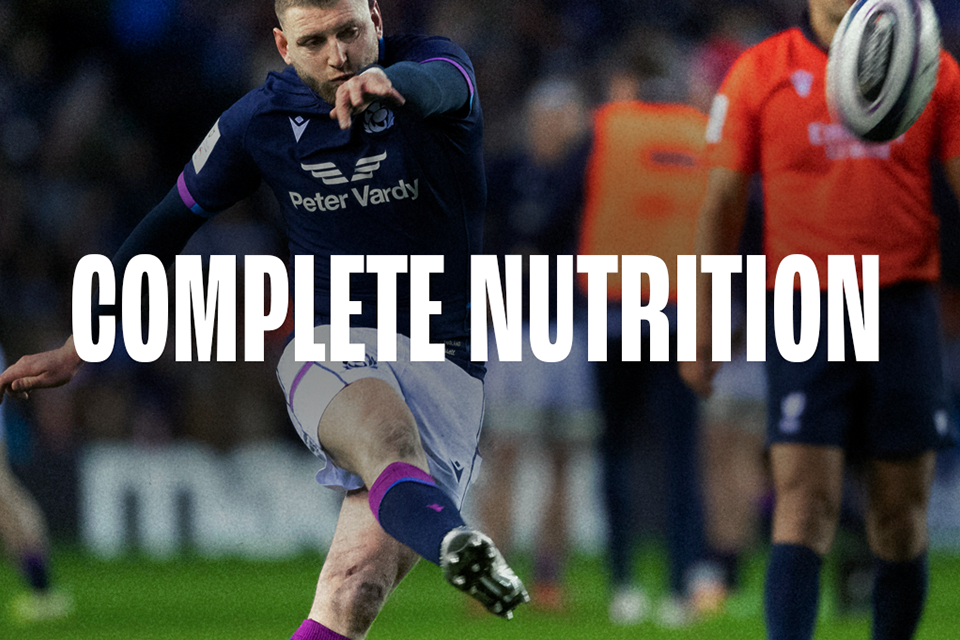
The approach, centered on “combining power and precision,” was crafted to resonate across all brand activities, spotlighting both athletes and nutritionists. This meant highlighting the physical and mental resilience of athletes alongside the precise, expert care that goes into product development for nutritionists who truly know their field.
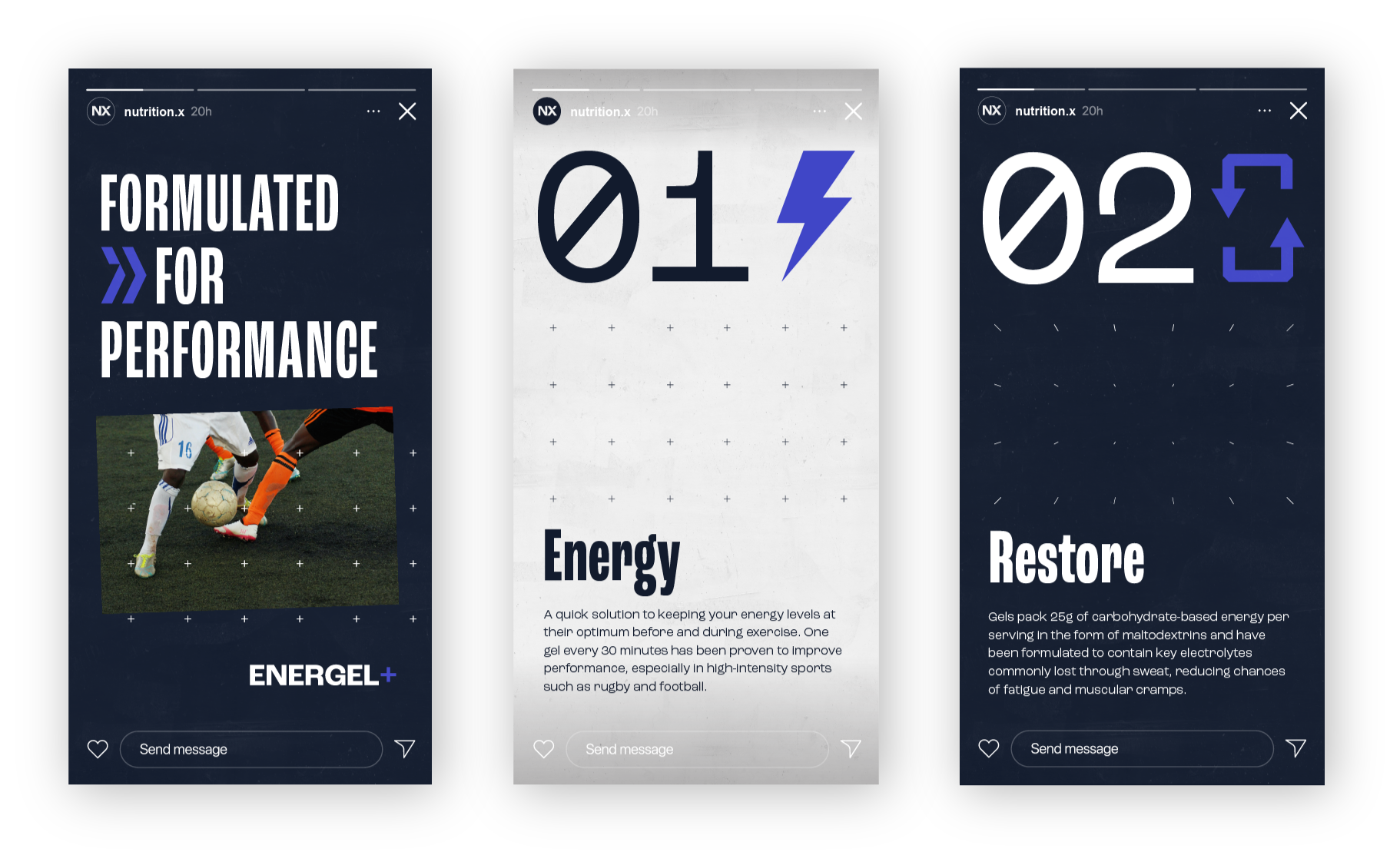
On social media, we aimed for a more organic approach, focusing on sport rather than overt branding. The goal was to position the product as a trusted support tool, keeping the attention on athletes and professional nutritionists as the heroes of the story.
Execution:
For the visual identity, I prioritised precision and trust, crafting a logo that communicates stability and credibility. This design allows it to integrate seamlessly among other professional brands while standing out with a distinctly science-driven appearance.
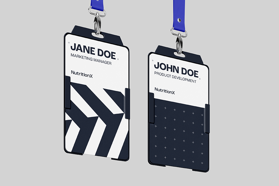
To emphasise the blend of power and precision, I developed a flexible pattern system that adapts across digital, print, social media, video, and motion graphics. The design incorporates chevrons inspired by the distinctive “X” in the logo, symbolising forward momentum, while “+” icons are arranged in both structured grids and spontaneous layouts to convey pinpoint accuracy.
This identity system guided the development of cohesive packaging that professionals can recognise at a glance, with crucial information and key selling points clearly presented for easy access.
To add depth to the brand story, I created a unique image and colour grading style that captures the atmosphere of dawn and dusk—echoing the dedication of athletes training at the day’s edges. This approach reinforces Nutrition X’s role as a trusted leader for resilient professionals.
Combining power and precision.
